Search

Where the Action Is

Where the Action Is

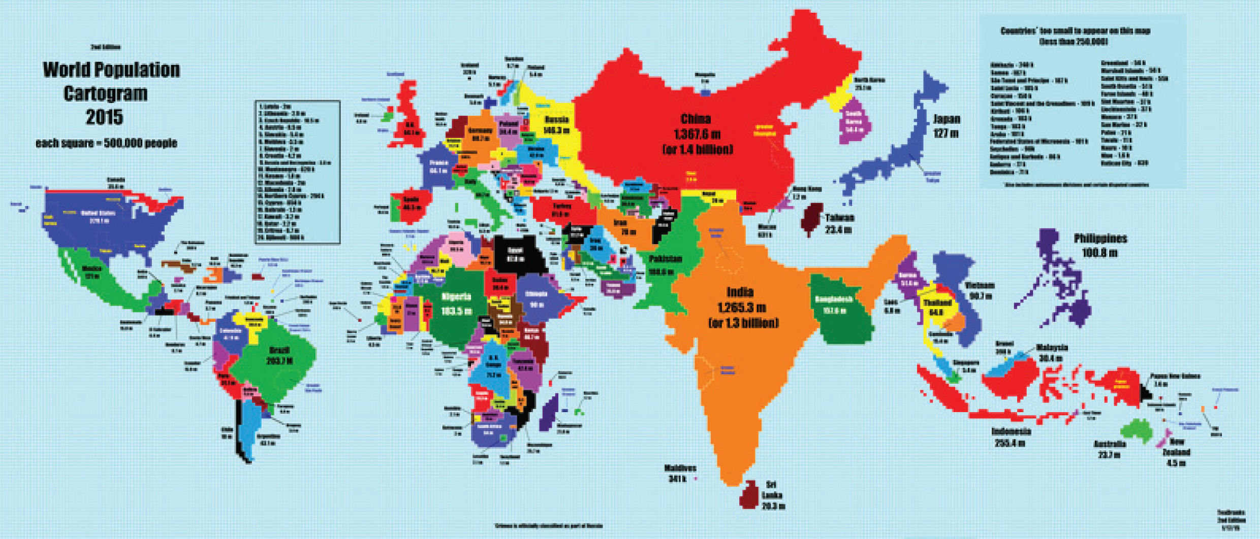
Let’s see where the action is! When you look at the geographic map of the world, you’re actually looking at several major distortions.  First, unless you’re looking at a globe, the map will show Antarctica, Greenland, Iceland, Canada and Australia as much larger than they actually are, while equatorial areas like the middle of South America and pretty much all of Africa appear diminished from their actual size.

The map also makes some of the larger countries look more significant to the world’s affairs than they actually are.  The accompanying map here shows the nations of the world enlarged or diminished proportionately according to their population, rather than their land mass, which is actually a much better measure of which countries have the most (current and future) impact economically.  By this measure, nations like Canada, Australia and especially Russia suddenly become relatively small, while southern Asia, Mexico and Indonesia expand dramatically.  Europe, the U.S. and Brazil are, interestingly, roughly the same size on both maps.

Source:
http://www.vox.com/2015/1/27/7918377/population-cartogram

This article was written for information purposes only and its content should not be construed by any consumer and/or prospective client as rebel Financial’s solicitation to affect, or attempt to affect transactions in securities, or the rendering of personalized investment advice for compensation. No client or prospective client should assume that any such discussion serves as the receipt of, or a substitute for, personalized advice from rebel Financial, or from any other investment professional. See our disclosures page for more information.

Facebook
Twitter
LinkedIn
Email

Comments are closed.