Don’t Believe Every Indicator You See

You’ve heard the phrase: “The most dangerous words in investing are: ‘This time it’s different.’”  Right?  But sometimes the investing world DOES change, perhaps permanently, and investors have to adjust with the transition.  This is made much harder when, as the markets experience adversity, people start posting all sorts of indicators and charts showing that the end is year.

A recent article on the Insecurity Analysis blog notes a couple of interesting examples.  One is the idea, which dominated the pre-1950s investment scene, that stocks should always yield more than bonds.  Why?  Because stocks are riskier, and therefore nobody would buy them unless they produced a higher dividend yield.  Whenever the dividend yield fell below what you could get from Treasuries, it was considered a strong sell signal for more than 50 years.

As you can see from the chart, where the green line is one of the safest bond investments in the marketplace, and the blue line is the dividend yield of S&P 500 stocks, this sell indicator was pretty much true until around 1955, at which time 10-year Treasuries began to out-yield stocks—and the difference persisted, and even increased, for more than half a century.  Why?  Because equity investors began to look for rising stock prices as the chief source of their return.  The world changed.

As you look at the chart, it’s interesting to note that recently Treasuries and stocks have been yielding about the same in recent years.  This may be one reason why people have been willing to buy and hold stocks even though they’re expensive by historical standards.  The alternatives—at least in terms of yield—are not compelling.

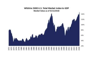
What else has changed?  In the past, stock traders watched the ratio of the total value of the U.S. stock market to the total U.S. GDP, as an indicator of when the market was becoming dangerously overvalued.  You can see this ratio over the years in the accompanying chart, going back to 1971, and indeed in the runup to the great tech crash, this indicator was sending sell signals.  It was also sending lesser signals during the runup to the 2008-2009 market decline.  And today—oh boy…

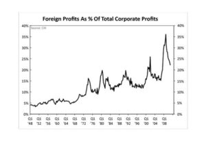
How could things be different today than in the past?  The next chart shows that, over time, American companies have been generating a growing amount of their profits overseas, which means that comparing their value to the strictly U.S. economy—where only somewhere between 65% and 80% of their profits are coming from—becomes less relevant.  The signal may have meant something the past, but today it is increasingly meaningless.

Finally, some traders have traditionally determined when equities were overvalued by looking at the ratio of U.S. stock valuations to foreign stock valuations in aggregate—the S&P 500’s price-to-book ratio divided by the MSCI All-World Index that excludes U.S. companies.  As you can see from the chart, U.S. stocks became quite a bit pricier in 2007 and early 2008 before the global selloff, and now the U.S. market—by this measure, at least—has moved into uncharted territory.

There’s no question that American companies are currently priced at higher multiples than comparable companies in Europe and Latin America.  But aggregate charts like this one may be less informative today than they have been in the past.  Why?  The composition of U.S. companies has moved in a different direction from the overall world index.  Today, 24% of the U.S. market cap is in the technology sector, which traditionally trades at higher multiples than, say, materials or energy.  By way of comparison, just 6% of the MSCI World index is in the tech sector.  The U.S. market is 14% weighted in health care—another high multiple sector—compared with 9% for the rest of the world.  Our companies are trading higher, in part, because they happen to be operating in more profitable sectors.

No doubt traders and analysts will come up with creative new metrics to evaluate whether the U.S. stock market is overvalued.  But if you’re reading about these metrics today as the markets experience unusual turbulence, and the article suggests that the metric is a sure indicator of the future, you might want to remember a new phrase: the world is constantly evolving, and whatever prediction mechanism might have worked in hindsight to explain the past may not do such a great job of predicting the future.

Source:

https://www.insecurityanalysis.com/writing/2018/10/9/beware-of-market-timing-rules-of-thumb-1959-1

This article was written for information purposes only and its content should not be construed by any consumer and/or prospective client as rebel Financial’s solicitation to affect, or attempt to affect transactions in securities, or the rendering of personalized investment advice for compensation. No client or prospective client should assume that any such discussion serves as the receipt of, or a substitute for, personalized advice from rebel Financial, or from any other investment professional. See our disclosures page for more information.

Facebook
Twitter
LinkedIn
Email

Leave a Reply

Your email address will not be published. Required fields are marked *